3 Results
3.1 Overview of underlying vulnerability, emerging threats and overall alert flags
Below we present a snapshot of results from the CRM showcasing the types of outputs that can be made available to decision-makers through the CRM. Further breakdown of summary plots and results can be seen in Annex Tables 4–6 and Annex Figures 6–9.
3.1.1 Global overview
Figure 3: Profile of UNDERLYING VULNERABILITY (i.e. static snapshot of historic predisposition to risk)
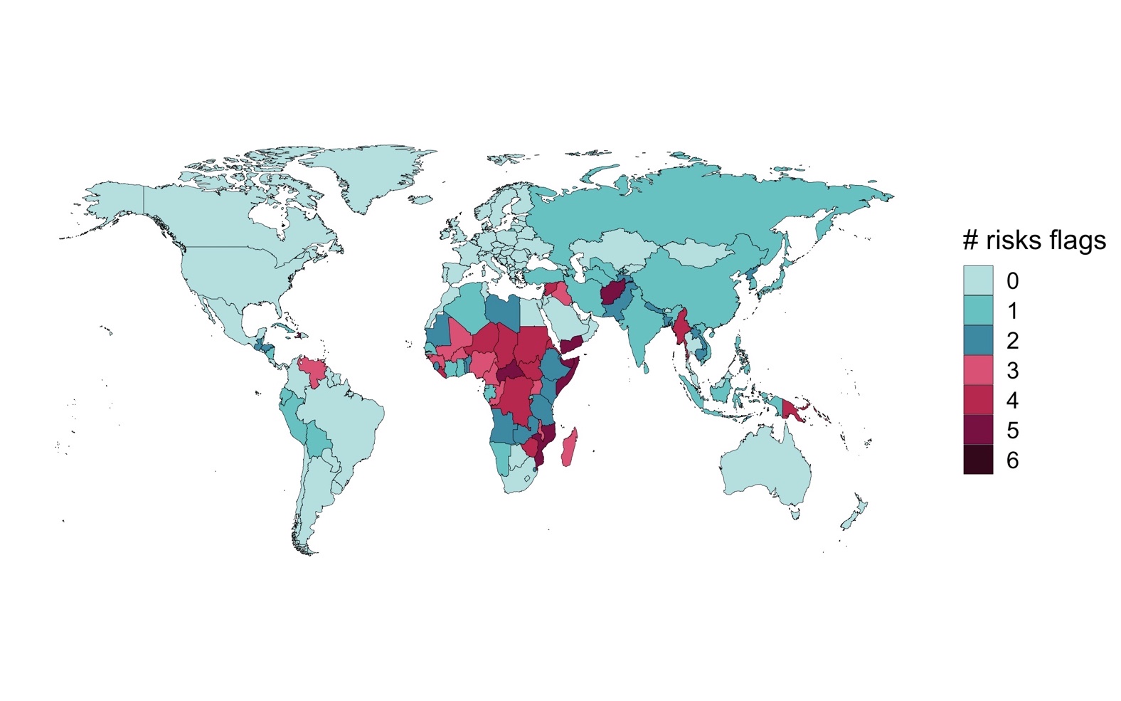
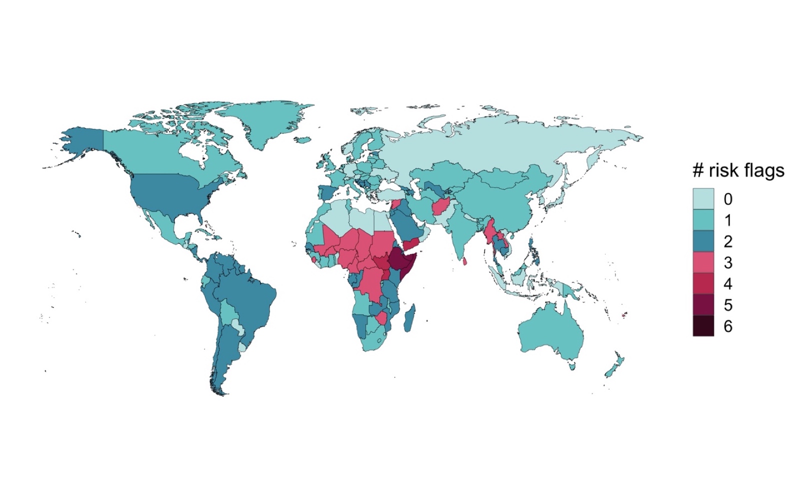
Figure 4: Profile of EMERGING THREATS (i.e. dynamic assessment of changing risk conditions16)
Notes: Level of compound risk devised as the sum of high and medium-risk dimensions (max score = 6). Medium-risks are assigned a score of 0.5, high-risks are assigned a 1. Scores are rounded down to the nearest integer for ease of viewing.
Figure 3 reveals a clustering of underlying vulnerability threats across a range of countries in Sub-Saharan Africa (SSA) and Middle East and North Africa (MENA). Afghanistan, Mozambique and Somalia stand out as countries rated as being especially predisposed to heighted compound risk. Indeed, of the 25 countries with four risk flags or more, only four (Haiti, Afghanistan, Papua New Guinea and Myanmar) are situated outside of SSA or MENA. Unsurprisingly the concentration and spread of underlying vulnerability presented under the CRM has many parallels with many other multi-dimensional risk indexes – such as INFORM and ND-GAIN.
While underlying vulnerability profiles provide an interesting static17 perspective on the potential for compound risk, understanding how current and future risk dynamics are materializing in real-time is often more relevant to operational decision making. Figure 4 showcases levels of emerging threats18 across countries using the same method of calculating compound risk (a combination of high and medium risks).
As a reminder, emerging threats in the CRM reflects countries and regions where there are changes in underlying risk conditions (rather than overall levels of compound risk).19 In particular, Ethiopia and Somalia currently stand out as areas where a number of compound risk dimensions are exhibiting worsening conditions (with 5 emerging threats or more). It is also worth highlighting that much of Latin America has 2 flags, largely reflecting high recent (and ongoing) exposure to COVID coupled with its expected longer-term implications on macro-fiscal and socio-economic conditions. Similar concerns related to the knock-on implications of COVID are experienced across many other regions. Other global signals affecting CRM outcomes include the implications of an ongoing La Nina for regional weather patterns, and heightened food insecurity concerns for much of Sub-Saharan Africa (further compounded by desert locust outbreaks across the Horn of Africa, MENA and South Asia). An annotated summary of regional risk highlights is provided in Annex Figure 1.
As mentioned above, the CRM is also able to provide a high-level overview of overall alert flags, calculated as the geometric mean of underlying vulnerability and emerging threats scores (see Annex Supplementary Text 1 for details). Despite its relative simplicity, this metric can be considered a decent gauge of a country’s overall risk of being affected by compound crises in the months ahead (as opposed to the emerging threats score which largely measures relative changes in underlying risk conditions). Figure 5 reveals a similar cluster of high-risk countries in Sub-Saharan Africa, including much of West Africa, the Horn of Africa and Southern Africa. Pockets of risk are apparent across MENA (namely Yemen, Lebanon and Syria), South Asia (Afghanistan, Sri Lanka), East Asia and the Pacific (Myanmar, Laos, Cambodia, Papua New Guinea) and Latin America and the Caribbean (Columbia, Venezuela and Haiti). While the overall risk scores must be interpreted with caution for reasons outlined above, it does provide an insightful snapshot of the extent of compound risk conditions in the near future and may be relevant for decision makers seeking to make direct comparisons across countries and regions.
Figure 5: Profile of OVERALL ALERT FLAGS (overall alertness needed in responding to given risk dimensions20)
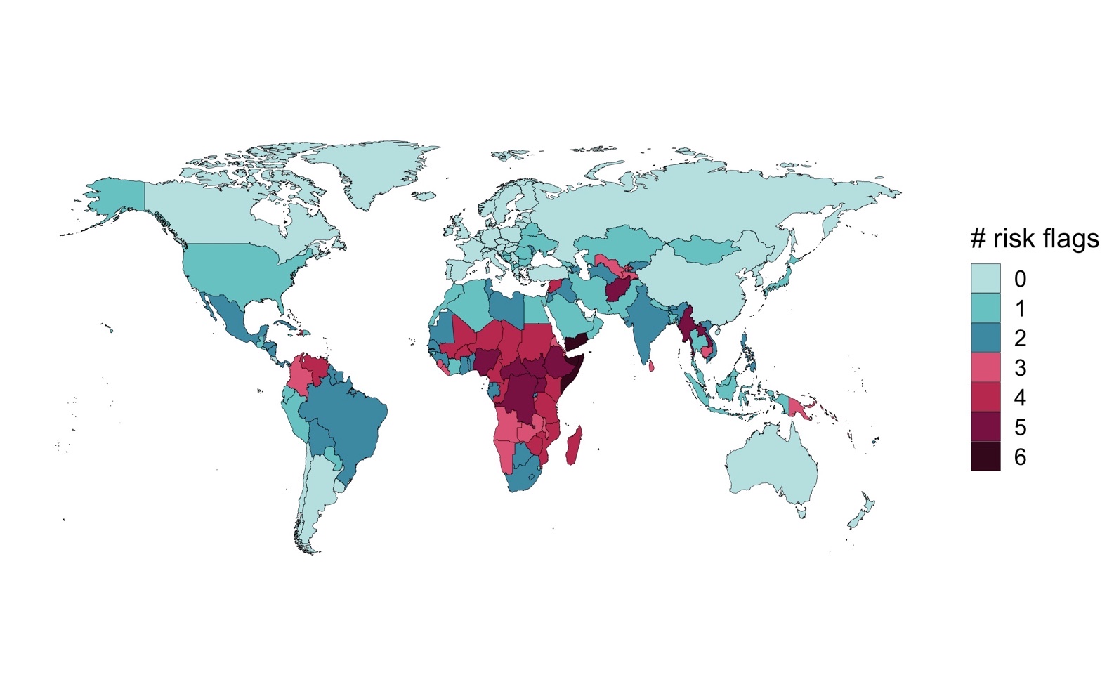
Note: Overall alert flags are using a geometric mean of underlying vulnerability and emerging threats scores. Country-level scores are decised as the sum of high and medium-risk dimensions (max score = 6). Medium-risks are assigned a score of 0.5, high-risks are assigned a 1. Scores are rounded down to the nearest integer.
3.1.2 Population under high alert
Alongside country-level risk profiles, the CRM can also be of use in providing broad regional-level insights on the magnitude of risk conditions in the months ahead. For example, Figure 7 showcases the total regional population and proportion of individuals affected by different risk flags by WB regions. This is done by summing populations in each country in each region – assuming that all those within a country are affected uniformly.
Figure 7: Total population under each risk flag category (emerging threats and overall alert flags)
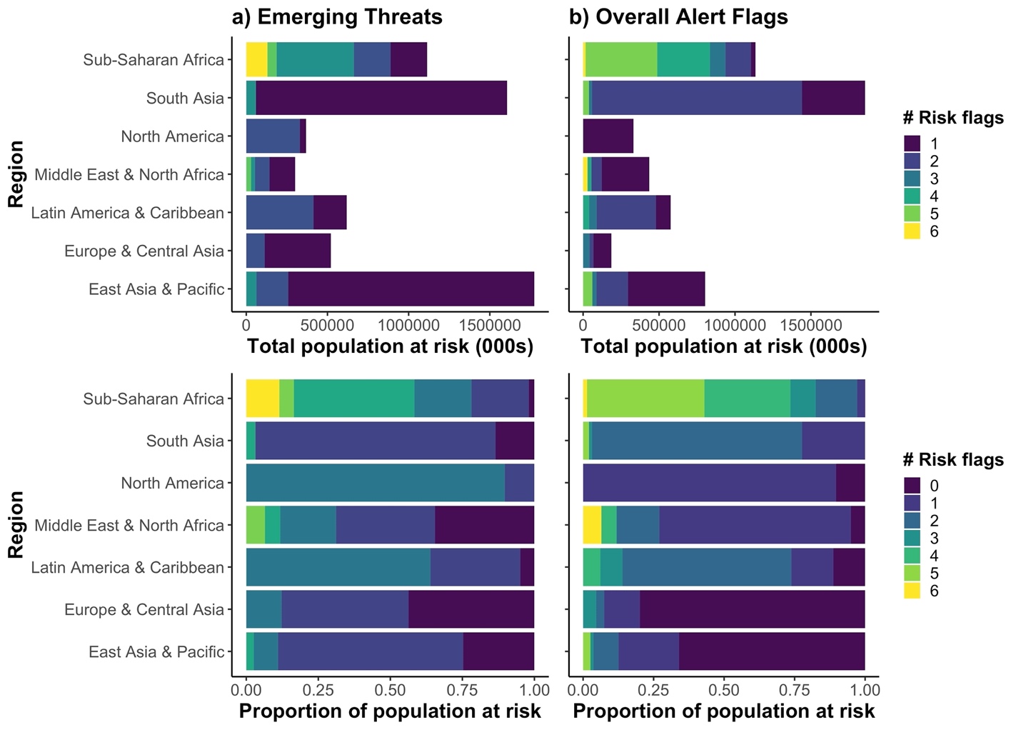
Note: Levels of emerging threats are calculated as the sum of high and medium risk flags (max score = 6). Medium risk flags are assigned a ½, while high risk flags are assigned a 1. Risk scores are rounded down to the nearest integer for ease of viewing. Numbers correspond to the total population of each country in given risk flag categories. All individuals within a country are assumed to be affected in the same way. CAVEAT: This is not meant as a projection of total number of people affected compound crises.
Here we see a wide range of geographic variation in the spread of compound risk, depending on the angle of interest. SSA clearly has the highest number of people covered under four of more emerging threat flags – both in terms of total population and proportion. However, it is interesting to note that MENA has the highest proportion of people classed under the maximum number of flags for the Overall Alert score (combing Underlying Vulnerability with Emerging Threats). Despite this, SSA has a far higher proportion of people with 4 flags of more, signaling that the vast majority of compound risk conditions can be found in the region.
A further break-down of the distribution of risk profiles can be seen in the Sankey diagram depicted in Figure 8. This charts the progression of people exposed to different risk conditions by comparing vulnerability and emerging threats scores. Globally, it is apparent that large shifts can occur between the two respective outlooks. Many of the phase transitions appear to arise in Africa, many of which upgrading from 1 flags for underlying vulnerability to 2–5 flags for emerging threats – suggesting a regional intensification of emerging threats. This contrasts with Asia, where the two categories appear to be more closely aligned.
Figure 8: Number of people moving between different risk categories over time (underlying vulnerability v emerging threats
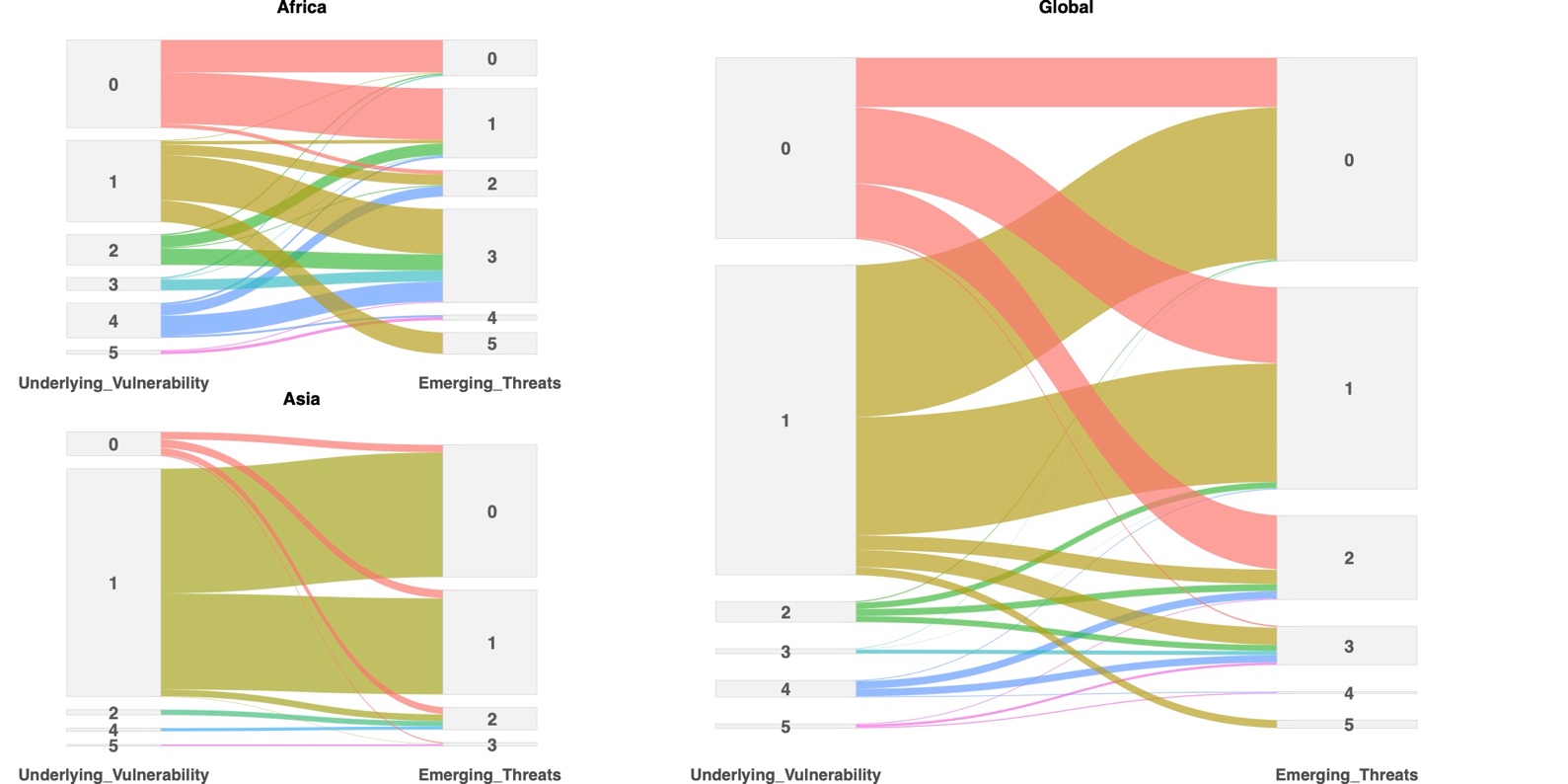
Note: Sankey diagram shows the total population in each risk category between vulnerability and emerging time periods. To calculate total populations each all individuals are assigned the same risk categories for respective countries in the Monitor.
3.1.3 Disaggregated view of risk
Alongside presentations of overall alert flags, there is a wealth of relevant information on risk profiles across individual dimensions. These reveal the detail and nuance of why a given country may be considered highly prone to compound risk and can support tailored sectoral interventions. Figure 9 showcases three countries taken from the CRM, with scores for each of the six emerging dimensions of risk visible. Mozambique stands out as a country with a large number of high-risk signals (five high risk flags and one medium risk). While conditions comparatively not as bad in Brazil, clear emerging threats can be seen with regards to the country’s health system and pandemic response as well as socio-economic vulnerabilities – both of which driven by the widespread impacts of COVID that have ravaged the country in recent months. Spain similarly has a high flag relating to its health system and macro-fiscal conditions – again reflecting toll of high COVID exposure. Again, this does not imply that overall risk levels in Spain are comparable to Mozambique or Brazil. Instead, it implies that risk conditions facing Spain’s health system are similarly deteriorating relative to the normal condition. In addition, while the expected impacts on socio-economic vulnerability in Spain are marked (largely driven by high levels of expected unemployment), risk profiles for the remain three dimensions remain low for the time-being.
Figure 9: Comparing emerging threat scores across the six dimensions of compound risk
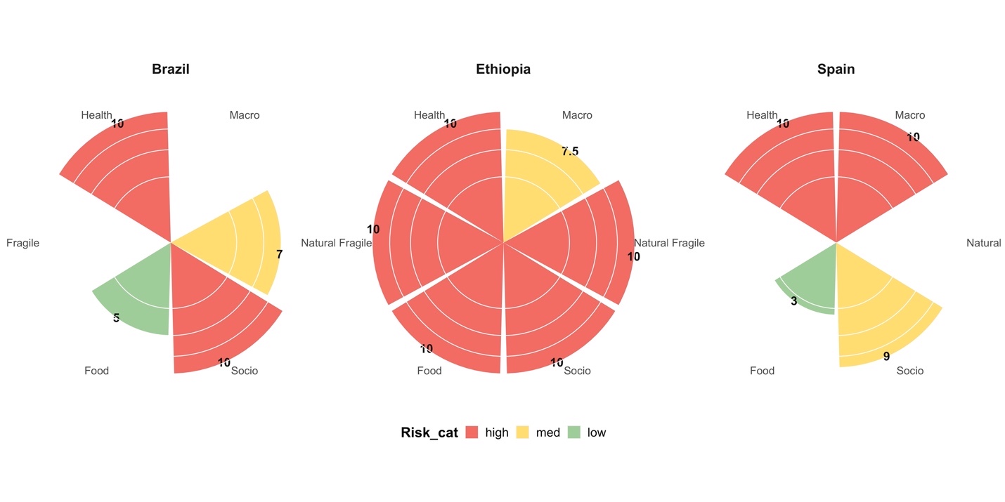
Note:21 Polar diagram shows risk levels for a range of multi-dimensional threats used in the CRM. Scores range from 0–10 for each dimension and are colored according to assigned risk categories (<7 = low risk, 7–9.9 = medium risk and 10 = high). The area under each risk score in the chart is equivalent, meaning that higher scores appear thinner.
Dynamic refers to the fact that underlying indicators are updated in real time at higher frequency (weekly to monthly depending on the indicators)↩︎
Static refers to the fact that underlying indicators change slowly over time and are updated solely on a yearly basis↩︎
Figures are accurate as of 25th January 2021↩︎
Hence similar risk scores for Panama and Somalia should not be interpreted as both countries facing the same risk of compound crisis. Rather, than both are experiencing a similar worsening risk conditions relative to the norm.↩︎
underlying indicators are updated in real time at higher frequency (weekly to monthly depending on the indicators)↩︎
Accurate as of November 12th↩︎